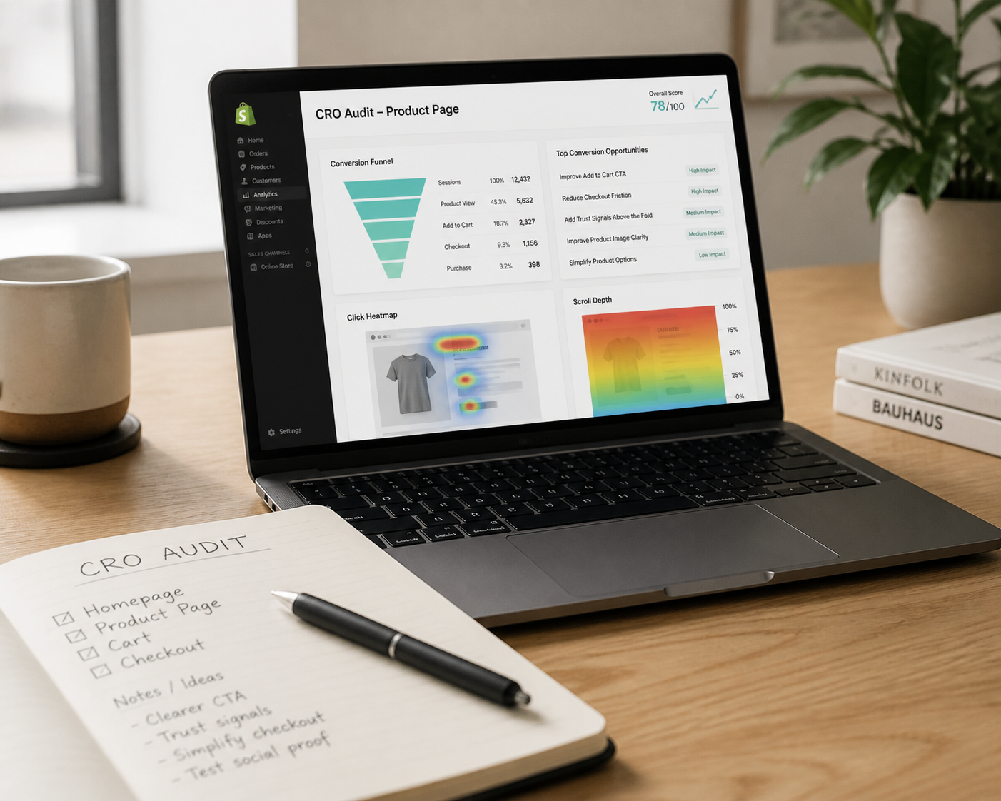
If you're running an ecommerce brand, you've probably felt this tension already.
Traffic is expensive. Creative burns out. Paid performance gets less predictable. And when revenue slows down, the default move is usually to spend more money getting more people to the site.
Sometimes that is the right move.
But a lot of the time, the bigger problem is simpler: your store is making people work too hard to buy.
That is where ecommerce conversion rate optimization, or CRO, becomes useful.
Not as a trendy growth acronym. Not as an excuse to test button colors for six months. And not as a generic checklist you paste onto every page.
Real CRO is about making it easier for the right customer to understand your offer, trust your brand, and move through the buying process without unnecessary friction.
For DTC brands, that usually means improving the parts of the experience that sit between a click and a purchase: the landing page, product detail page, cart, checkout, and the flows that recover or grow revenue after the first visit.
Done well, CRO helps you get more from the traffic you already paid for. It can also improve average order value, strengthen retention, and make your paid acquisition math healthier overall.
Why CRO matters more when acquisition gets harder
A lot of ecommerce teams still treat conversion problems like traffic problems.
Revenue is soft, so they push harder on Meta, launch another campaign, or refresh creative again.
That can help, but it does not solve the underlying issue if the site experience is weak.
If your landing page does not match the promise in the ad, people bounce.
If your PDP leaves basic questions unanswered, they hesitate.
If your cart adds friction or your checkout creates doubt, they drop off.
So the real question is not just, "How do we get more clicks?"
It is, "What happens after the click, and why are people not moving forward?"
That shift matters because CRO compounds. A better site experience does not only help one campaign. It improves the efficiency of paid traffic, organic traffic, email traffic, and returning visitors at the same time.
That is why strong DTC brands tend to think of conversion as infrastructure, not a one-off project.
What ecommerce CRO actually means
At its core, ecommerce CRO is the process of improving the percentage of visitors who take the action you want them to take.
Usually that action is a purchase. But depending on the page, it can also mean:
- clicking through from a landing page to a product page
- adding a product to cart
- starting checkout
- completing checkout
- opting into email or SMS
- accepting an upsell
- choosing a bundle or subscription option
That is important because sitewide conversion rate alone does not tell you enough.
If overall conversion is low, you still need to know where the leak is.
Is the issue:
- weak message match between ad and landing page?
- low add-to-cart rate on the PDP?
- a cart that does not build enough confidence?
- a checkout that introduces surprise costs or extra effort?
- a post-purchase system that misses repeat revenue?
Good CRO answers those questions before jumping to solutions.
CRO is not random testing
One of the biggest mistakes founders make is assuming CRO means endlessly testing tiny page elements.
Sometimes small tests matter. But most stores do not need more random experiments. They need better diagnosis.
A useful CRO process usually looks more like this:
- Identify where users are dropping off.
- Understand why that drop-off is happening.
- Prioritize the highest-leverage fixes.
- Implement, measure, and keep iterating.
That is a very different mindset from throwing urgency bars, trust badges, and popup tools at a page and hoping one of them works.
Start with the funnel, not the homepage
The fastest way to make CRO feel vague is to talk about "improving the website" as one big idea.
The better approach is to break the buying journey into stages.
1. Landing page or first-click experience
This is the moment where the visitor decides whether the click they just made was worth it.
If someone clicks an ad about a specific offer, product benefit, or pain point, the page they land on should confirm that immediately.
That means:
- the headline should make the offer clear
- the page should visually feel connected to the ad they clicked
- the next action should be obvious
- the page should load quickly, especially on mobile
A lot of brands lose people here because the page looks polished but does not continue the conversation the ad started.
2. Product detail page
For many ecommerce brands, the PDP is where the sale is won or lost.
This page has one main job: reduce uncertainty.
A first-time buyer is trying to answer questions like:
- What is this exactly?
- Is it right for me?
- Why is it better than the alternatives?
- Can I trust this brand?
- What happens if I do not like it?
- How long will shipping take?
If your product page makes the customer dig for those answers, conversion suffers.
This is why good PDPs usually combine clear product education with strong visual hierarchy, obvious purchase controls, useful proof, and objection handling.
3. Cart and checkout
This is where many brands discover that high intent does not guarantee a completed order.
Someone can want the product and still fail to convert because:
- shipping costs show up too late
- payment options feel limited
- checkout takes too many steps
- the cart does not reinforce value
- trust is not visible when anxiety peaks
At this stage, clarity beats cleverness.
The user should always know what they are paying, what happens next, and why they can feel safe completing the order.
4. Post-purchase and retention
CRO does not stop at the purchase.
If you only optimize for first-order conversion, you leave a lot of value on the table.
For many DTC brands, a healthier growth model also includes:
- post-purchase upsells
- replenishment or reorder flows
- cross-sell email and SMS
- subscription offers where they genuinely fit the product
- review and UGC generation systems that improve future conversion
This is where CRO starts connecting to AOV and LTV, not just immediate conversion rate.
The five most common leaks on DTC sites
Every store is different, but the same problems show up again and again.
1. Weak message match
A visitor clicks because something caught their attention. Maybe it was a problem, a promise, a result, or an offer.
If the page they land on does not continue that exact thread, they feel friction immediately.
This is especially common on campaign landing pages and paid traffic funnels.
2. Clarity problems
A lot of ecommerce pages look good but make customers do detective work.
The visitor should not have to figure out what the product is, who it is for, how it works, or what makes it worth the price.
Good conversion design reduces thinking. It does not add more of it.
3. Missing trust at the point of decision
Trust is not just about having reviews somewhere on the site.
It is about placing the right proof near the moments of hesitation.
That can include:
- ratings and reviews near the buy box
- clear shipping and return information
- relevant guarantees
- press or third-party credibility when it is actually meaningful
- transparent product education and FAQs
Generic proof is less effective than specific proof that answers a real concern.
4. Mobile friction
Many DTC brands get the majority of traffic on mobile while still making key decisions based on desktop previews.
That creates obvious issues:
- add-to-cart buttons buried too far down
- cramped layouts
- hard-to-scan copy
- image stacks that slow the page down
- awkward navigation and form completion
If mobile traffic is strong but mobile conversion lags badly behind desktop, you usually have a UX problem worth prioritizing.
5. Disconnected design and conversion thinking
This is one of the most expensive mistakes because it looks sophisticated from the outside.
A brand invests in a redesign, the visuals improve, the site feels more premium, and everyone assumes performance will follow.
Sometimes it does.
But design that is not tied to buying behavior can easily become decorative instead of persuasive.
Strong ecommerce design should support conversion by making the product easier to understand, the offer easier to evaluate, and the next step easier to take.
The metrics that actually help you decide what to fix
If you want CRO to be useful, track the numbers that help you make decisions.
A practical starting set looks like this:
- overall conversion rate
- landing page click-through rate
- product page add-to-cart rate
- checkout initiation rate
- checkout completion rate
- average order value
- repeat purchase rate or subscription take rate, if relevant
The goal is not to drown in dashboards.
It is to understand where progress stalls.
For example:
- Low add-to-cart rate often points to PDP issues.
- Strong add-to-cart rate but weak checkout completion points to cart or checkout friction.
- Healthy first-order conversion but weak repeat purchase points to retention and lifecycle gaps.
When you read metrics this way, CRO becomes much more actionable.
A simple 90-day CRO roadmap for growing DTC brands
If your brand is early or mid-stage, you probably do not need a massive experimentation program on day one.
You need an ordered plan.
Phase 1: Audit the highest-value pages
Start with the pages closest to revenue:
- top landing pages
- top product pages
- cart
- checkout
Review them through a conversion lens, not just a design lens.
Look for friction, unclear messaging, slow load points, trust gaps, and missed opportunities to guide the user forward.
Phase 2: Fix obvious friction first
Do not A/B test things that are clearly broken.
If your shipping information is hard to find, make it visible.
If your mobile buy box is weak, fix it.
If your add-to-cart button blends into the page, change it.
If your product copy does not answer basic objections, rewrite it.
You do not need a test to justify common-sense fixes.
Phase 3: Build a testing backlog
Once the major issues are addressed, create a tighter list of hypotheses.
Examples:
- If we make the hero value proposition more specific, more visitors will click through to the PDP.
- If we move trust-building content closer to the buy box, add-to-cart rate will improve.
- If we make bundle logic easier to understand, average order value will increase.
This is where structured testing becomes valuable.
Where CRO and ecommerce design should work together
The strongest ecommerce work usually does not treat CRO and design as separate disciplines.
That is because most conversion problems are also communication problems.
A page that does not convert often has one or more of these issues:
- the hierarchy is wrong
- the copy is vague
- the visuals do not support the decision
- the important information shows up too late
- the next step does not feel obvious
That is design work.
But it is design work aimed at business outcomes, not just presentation.
For DTC brands, that matters because the site is not only a brand surface. It is also the place where acquisition spend either turns into revenue or gets wasted.
When outside help starts to make sense
There is a point where doing CRO in-house gets hard.
Usually that happens when the team knows the site needs to perform better, but they are stuck in one of three places:
- they cannot clearly diagnose the biggest leaks
- they have too many ideas and no prioritization
- they can see the opportunities but do not have the time or design bandwidth to execute well
That is often where a conversion-first design partner becomes useful.
Not because they bring secret hacks.
But because they can look at the funnel as one system, connect design decisions to revenue levers, and help you focus on the fixes that actually matter.
For some brands, that starts with a CRO audit. For others, it starts with a redesign of the highest-value pages, plus the retention flows that support them.
The right entry point depends on how mature the site already is.
Final thought
The best CRO work is rarely flashy.
It is usually a series of smart, grounded improvements that make the buying experience feel clearer, faster, safer, and more convincing.
That is why the strongest ecommerce brands do not ask, "What tactic should we copy next?"
They ask better questions:
- Where is the customer getting stuck?
- What is making them hesitate?
- What would make this decision easier?
- What part of the journey deserves attention first?
Answer those well, and conversion starts to feel less like guesswork.
If your brand is already buying traffic and you suspect the site is underperforming, a good next step is not necessarily another campaign.
It might be a careful look at the funnel you already have.